Grow engagement and a sense of belonging.
Reposition Blue Note Milano for a younger, curious and creative audience while preserving its cultural legacy.
Visual identity · Art direction
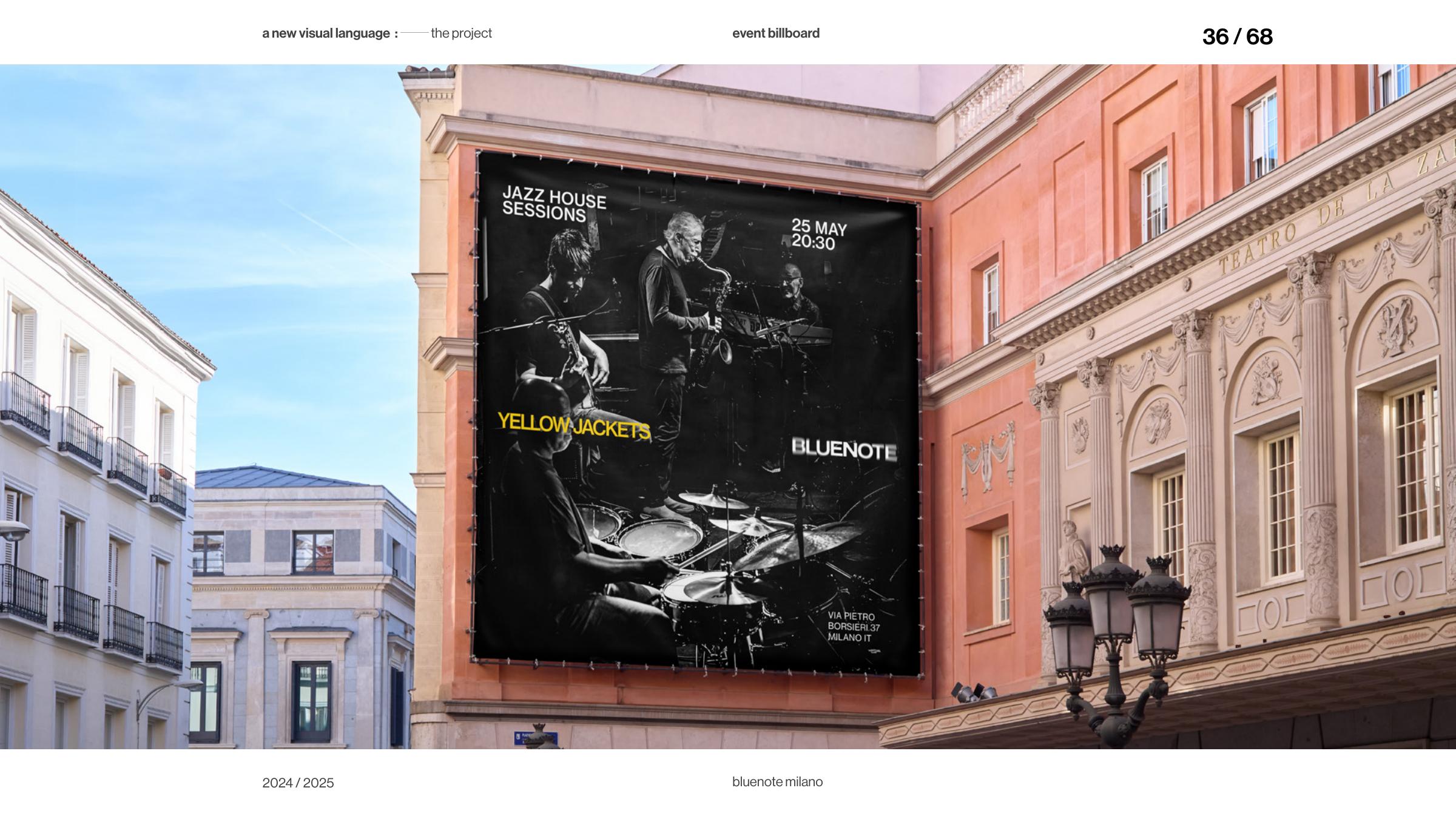
A way of working
The rebranding of Blue Note Milano sets out to hold two things together: the club’s cultural legacy and the immediacy of live music. The resulting system stretches from the venue into the city, carrying the atmosphere of a performance across formats.
A rebranding for Blue Note Milano, translating the club’s musical legacy and the immediacy of live performance across formats.
A visual language for a living music legacy.
Not a static mark, but a system that listens, responds and changes with the music.Bluenote · Visual direction
Reposition Blue Note Milano for a younger, curious and creative audience while preserving its cultural legacy.
The existing brand was classy and consistent, but its communication lacked the dynamism and storytelling of live music.
Typography carries the structure; image, blur and modular composition introduce the movement and unpredictability of jazz.
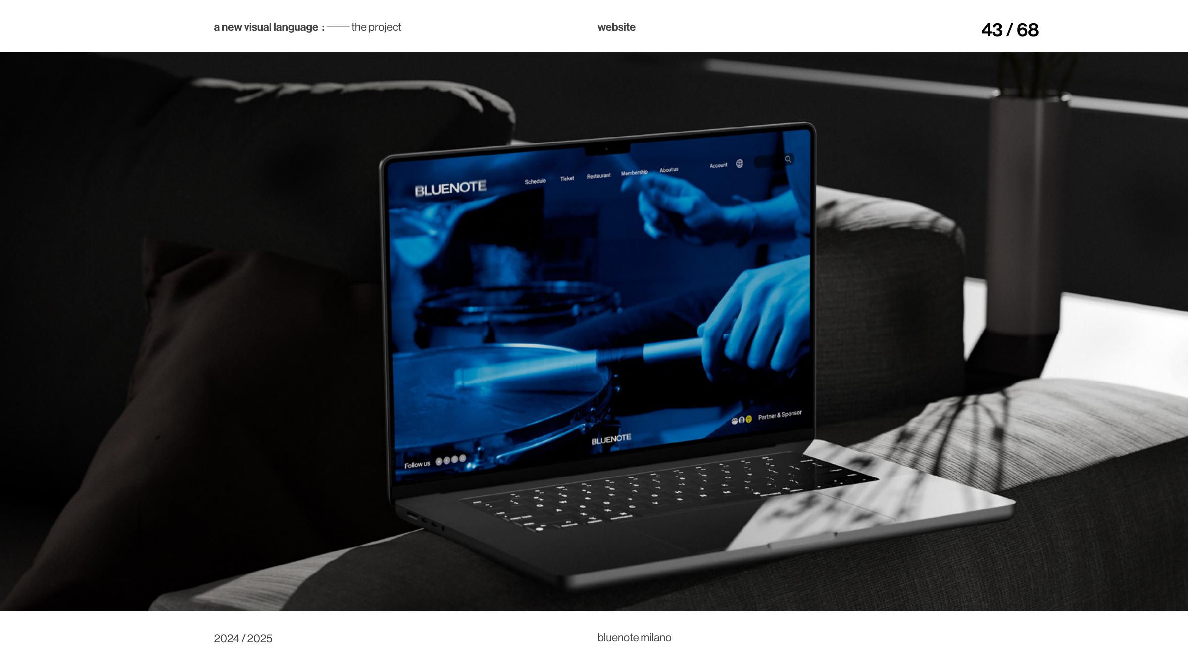
A new visual language carries a stronger story across digital channels, posters, tickets, social media, merchandise and the venue.
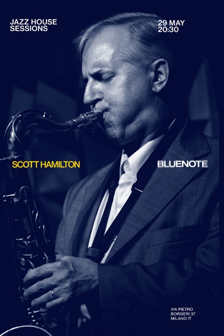
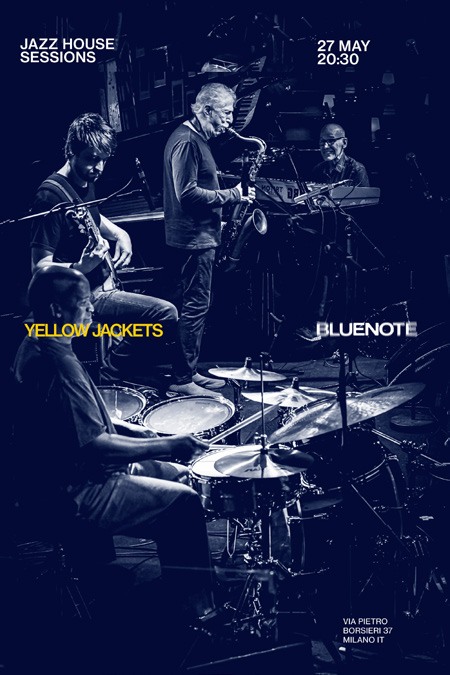
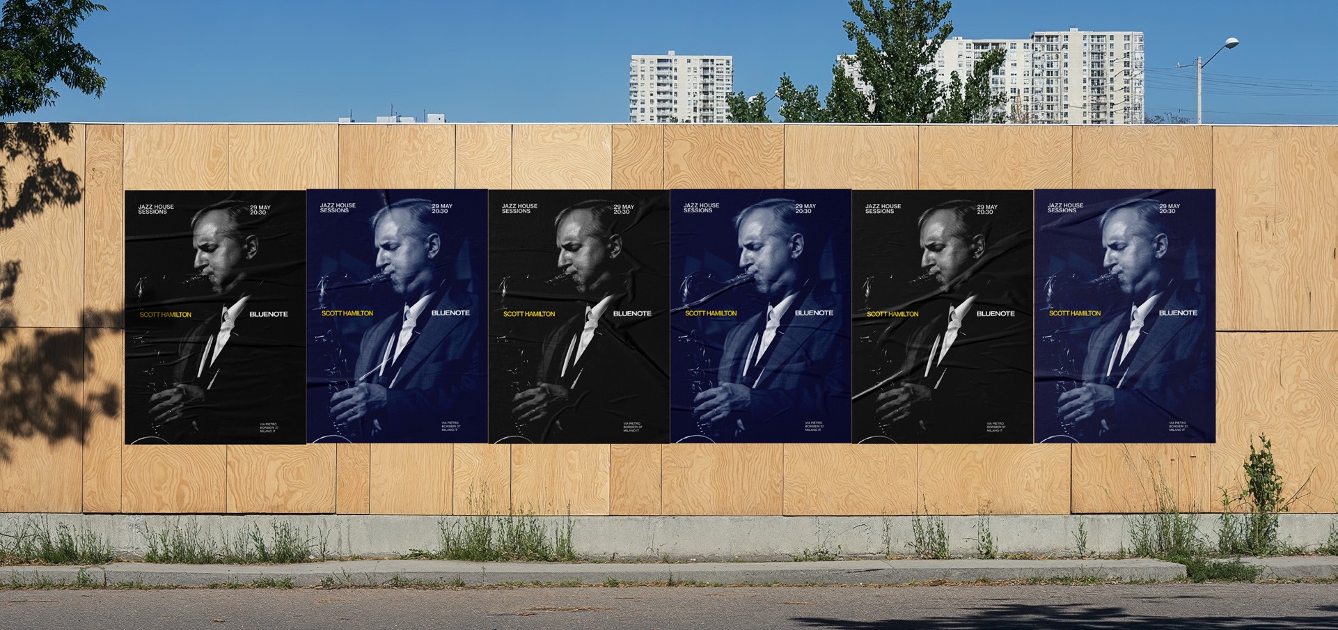
Across posters, tickets, digital touchpoints, social media and merchandise, the system shifts in scale while retaining a recognisable voice.
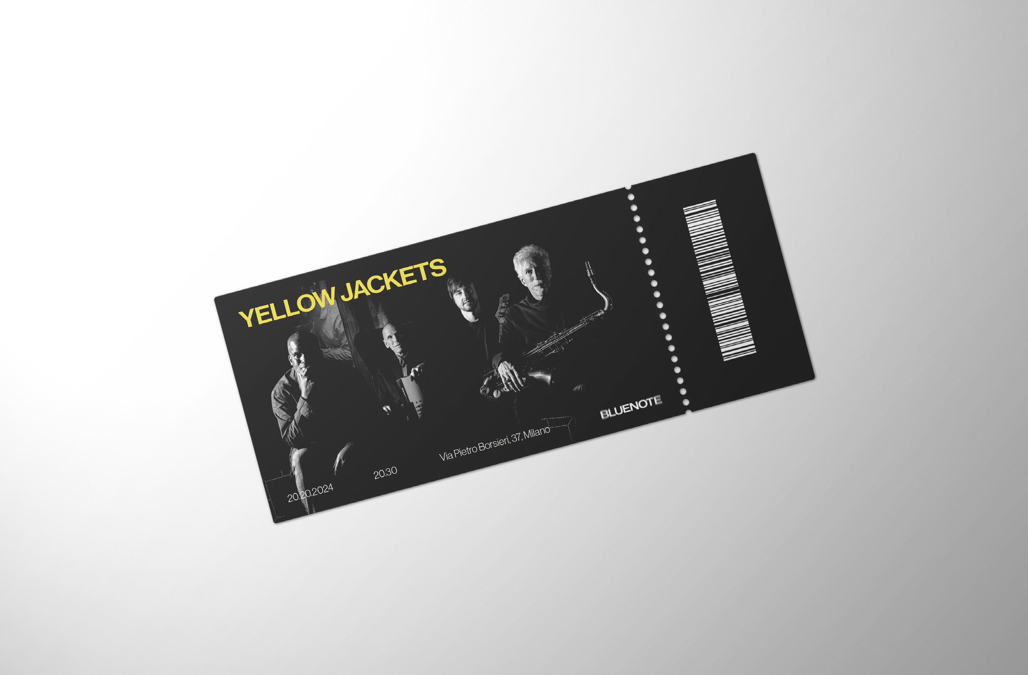
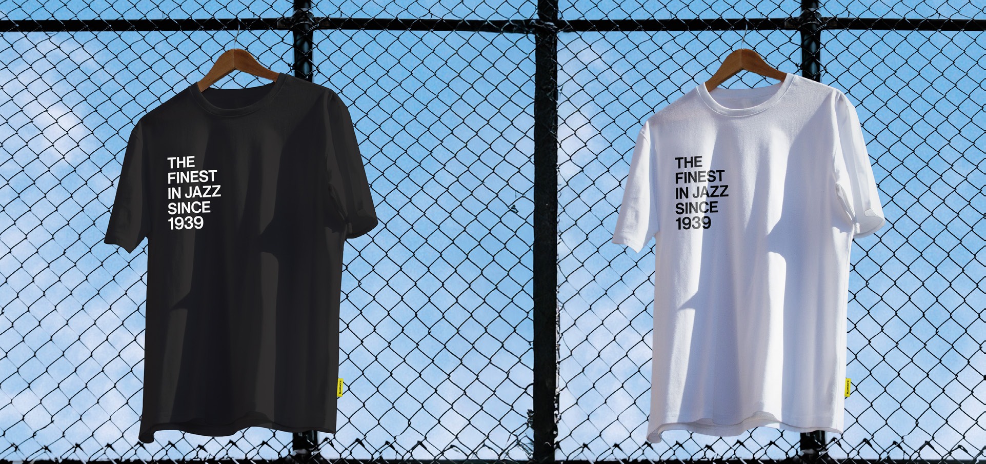
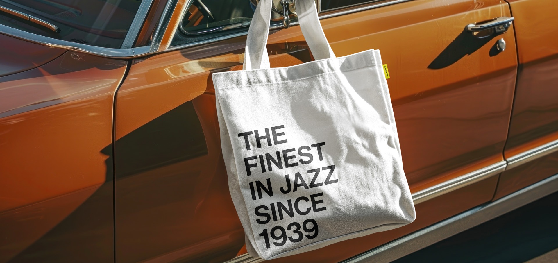
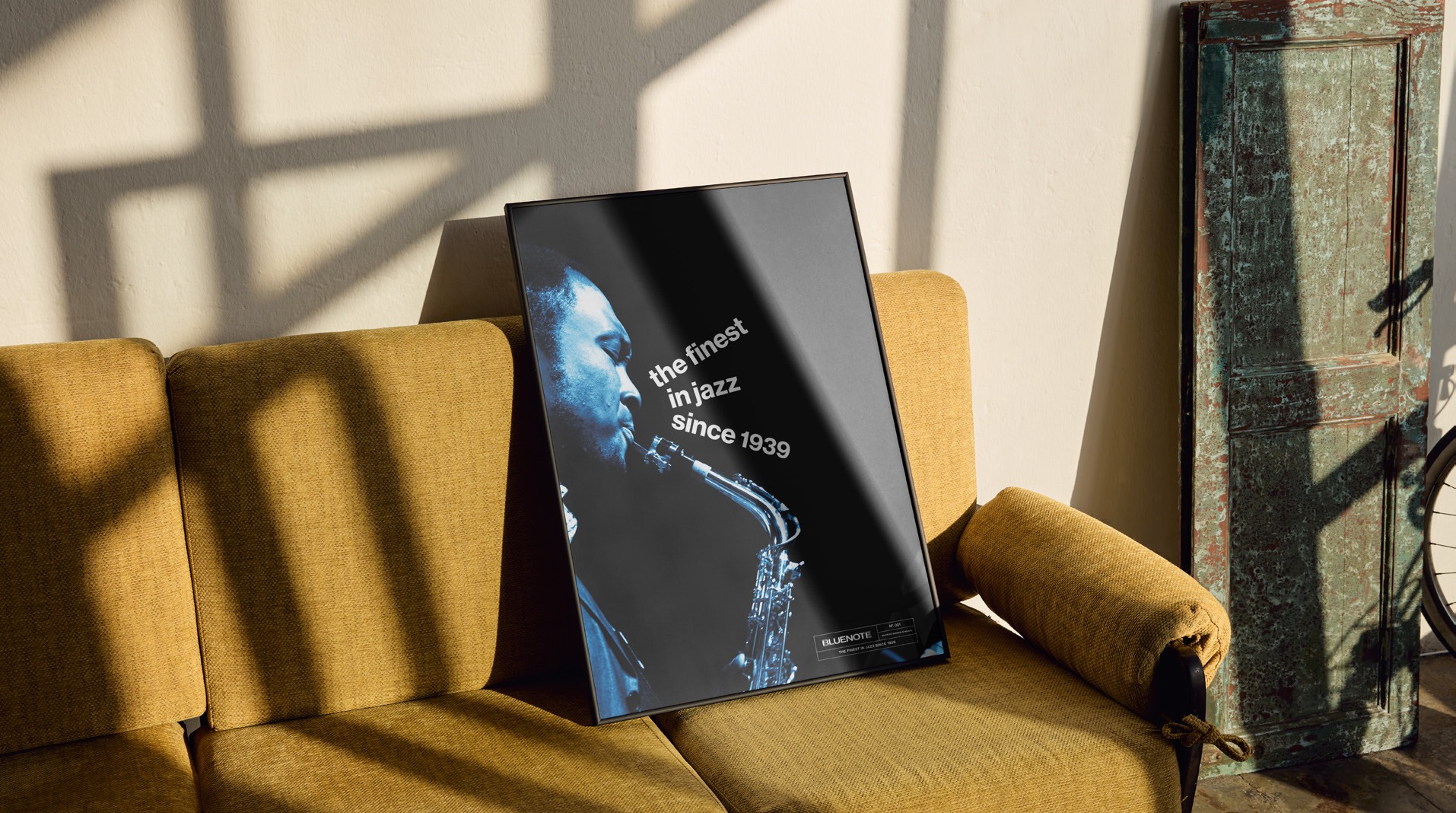
The identity moves beyond the venue, translating the atmosphere of live music into a visual presence across the city and its screens.

A visual system has room to make a cultural legacy feel present, personal and open to new audiences.
More about my practice ↗